For the Final show, I designed my own brand logo using Adobe illustrator. Since I have never thought about the name of my brand, it was quite challenging to come up with the brand name.
Thinking about what would be appropriate and suitable for my lingerie brand, I decided that it would be better to associate my name(Minju Jeong) with it than to come from other words.
There were a few options like standing for letters of my name - MJ, MJJ, JMJ or MINJ. However, I thought these options are stale and featureless.
With several attempts, I found that there are two js when I looked at the spelling which stood out the most in my name.
Double J.
I liked it because it was something simple, easy to remember, and also has features. I made a logo right away and it wasn't as easy as I thought.
To begin with, I drew some drafts designs like down below.
 |
| Idea sketch |
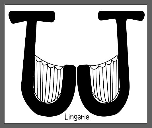
I would like to connect the logo with the lingerie so I drew the letters like a bra and put the letters in the lingerie icons. I liked the last one.
 |
| For no reason, I just wanted to apply colours on the background and the logo as well. |
 |
| Using pen tool I drew J like what i expected. |
 |
| And drew bra cup between its stroke. |
 |
| also drew lace details to seems like more a bra. |
 |
| then put more details to look like a bra. |
 |
And pasted and reversed it. However, it looked like W, not J and the colour did not work well. So I started all over again.
|
 |
| So I drew J again on the white background to look it more like J. |
 |
| added Lingerie words just below the main logo, but to me, it is too simple. |
|
 |
| generated light-purple-colour polygons behind main logo and it looks more the brand for young people and unique. |
However, I am still hesitating to choose the final logo between a simple one and coloured one for the final show and I think I should consider more with my final works.
With the tutor's feedback and advice, I decided to recreate the brand logo with Online logo maker and this is the outcome for a new brand logo.
The reason why I chose Gooddog font for JJ in the backside was when I typed the JJ together, it seemed like two human body and added "Double J" in the front of the letter to emphasis the brand name clearly.
Furthermore, I changed the colours like skin colours connected with Contour fashion design and compared the different colours with three examples.
Final I chose this one as the final outcome for the brand among the three tamplets.


This logo needs some development and if I was you I would not hand draw this! You might be better to go onto a logo creator online as this would look far more professional
ReplyDelete